 Repetition is a fundamental concept in the design world. Whether repetition is part of “harmony” or “visual echo” or just plain common sense — intentionally integrating repetition into logo design works. Do you need more reasons?
Repetition is easier for the eye to see and the brain to recall, and that translates into consumers needing less exposure to remember your designs. Therefore, when clients see your logo on business card printing or a brochure, for instance, they will be more likely to remember your company later.
The other way to improve recall of your logo design is to make it incredibly simple. But who says repetition and simplicity are mutually exclusive? Below are two quick ideas for how to use simple shapes and repetition for logo design in Illustrator CS5, along with some inspiring logo examples:
- use the shape builder tool for quick repetitive logo design
- use the golden ratio for quick repetitive logo design
- view famous repetitive logos for inspiration
Idea #1 — Using the Shape Builder Tool
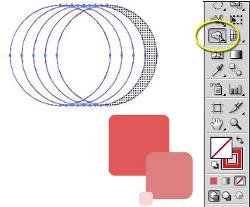
Start with a blank slate. Using the Shapes Tool, pick a shape, any shape, but stick with one of the simple forms for now. I like circles.

Now copy this 5-6 times and move it evenly. Use the Distribute feature in the Align window to get it all just right by selecting all the circles and clicking Verticle Align Center, or use shift+arrow keys.

With your shapes selected, remove the foreground color and add a stroke color of your choice. Notice how this removes depth perception. You cannot tell which circle is in front.

Here’s where the fun begins. Select your circles and grab the Shape Builder Tool. Select a foreground color of your choice and click in the white space of one of the outer circles.

Bam! The sky is the limit using a simple circle and the Shape Builder Tool to fill in white space and re-create the depth of field you want. Of course, this is overly simple, but it demonstrates how easy it can be to create new ideas fast with simple shapes and the Shape Builder Tool.

Idea #2 — Colors and Squares and the Golden Ratio
The golden ratio is a wonderful standard that can be seen throughout nature. When shapes and elements use the proportions of the golden ratio, it appears very natural and organic to our eye. For the techies, here’s your formal description compliments of Wikipedia:
For the rest of us, we need something practical. You can download my golden ratio template and use it for your own projects:

Let’s get started. Reset your palette or hide everything you previously made. Grab a rounded rectangle and hold shift while placing the shape to get it just right.

Create a few more of varying sizes and start applying some color treatments.

When applying the golden ratio, I use the pre-designed file by placing it onto my document and moving it around as needed. Use it now to set up your rectangle shapes and positions.

My final version centers each smaller rectangle on the corner of the larger. This creates a unifying theme, three colors, and a single, repeating shape.

Again, super-simple, but effective. The principles are easily reproducible with any shape, and the golden ratio gives you a standard by which to measure sizes and distances. And there is still a world of creativity within these confines.
For Your Logo Design Inspiration
Here are a few examples of logo designs with repeating shapes. Maybe you’ve seen some of these around…

The logo for Volkswagon uses the same “V” shape in repetition to create both letters. Also, the circle within a circle idea is used here.

Audi uses a simple but very memorable logo with repeating, intertwining circles, a great way to convey unity and and strength.

The Olympic logo also embraces circles that connect repetitively to convey the connection that occurs across countries all over the world during this event.

The repeating patterns of stripes across the letters gives this IBM logo a digital look.

The famous NBC logo uses the same shape to create feathers of a peacock, placing them so that the body of the peacock appears in the negative space.

Adidas uses the repeating leaf shape along with stripes to make a tri-patterned look.
Do you have any repetitive designs you’ve created? Or do you have any favorite public designs or artworks that use repetition?
Author’s Bio:
Tara Hornor has a degree in English and writes about marketing, advertising, branding, graphic design, and desktop publishing. She works for PrintPlace.com, an online printing company that offers postcards, posters, brochure printing , postcard printing , and more printed marketing media. In addition to her writing career, Tara also enjoys spending time with her husband and two children.